I want to share some midterm updates regarding my GSOC 14 project- Bootstrap for CiviCRM
As many suggested that both the original UI of Civi and Bootstrap UI should co-exist, I took form elements as the basis and tried on re-working from original UI to Bootstrap UI and I have had some success in doing that.
Task 1:
My main task at the beginning of project was to map the templates files in the CiviCRM core for all relevant elements. I could find the files after some digging (Special thanks to Jeremy for helping me out). The Templates files are placed at civicrm\civicrm\templates\CRM
Task 2:
Once I found out the relevant files the main task was combining and integrating Bootstrap CSS file with CiviCRM css file. I wrote the styling in .less and compiled into .css and the file was placed in \civicrm\civicrm\css\civicrm.css
Once I have done that it was replacing in the front-end, I experimented changing the colour of text in the .less etc. and these were reflected in the front-end. This was my first milestone in the project.
Task 3:
Once the css part was being reflected in front-end, I starting to change the code of labels. In bootstrap all the elements are placed in containers so for that I had to locate the crm-container class which was at civicrm\templates\CRM\common\wordpress.tpl (I am working on WordPress so I have made changes in wordpress.tpl) By adding the wrapper class to the core I could reflect it in front-end.
Task 4:
Now I began working on the elements, beginning with labels and text boxes. As I could find the base code at templates/CRM/Profile/Form/Dynamic.tpl. I made some tweaks to the code like adding classes like form-control, control-label as needed in Dynamic.tpl file and I could customize it with Bootstrap CSS including dropdowns and checkboxes. With this, bootstrap CSS was applied to all the text-fields with in the CiviCRM. These form fields scale smoothly across multiple screens and mobile screens in particular.
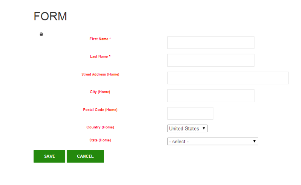
Some snapshots of the CiviCRM UI with Bootstrap’s CSS:
The desktop version of form
Form scaling across mobile screen

Goal for Upcoming week:
We have zeroed in on creating a custom QuickForm renderer to replace the default renderer with bootstrap styling. This has been a tough step to cross and I have been posting on the forum for help/leads on how to go about it. The discussions along with daily updates are available here
Any help/suggestions in this regard are welcome!
The github fork of the project is available here
I am confident that by the end of project, we will have all user facing elements bootstrapped!
I want to thank my mentors Emily Frazier and Nina Reyes for extending their total support when I have had any issues.